Background:
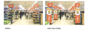
Sainsbury’s existing ‘value’ point-of-sale did not stand out or achieve cut-through. As a result, Sainsbury’s was simply not getting the credit for the ‘value’ it offered to its customers.
Insight:
Many people know their local store layout clearly and shop on autopilot. As a result, shoppers spend only 5% of their time looking at in-store materials. And of this 5%, 66% is spent at the shelf edge. Moreover, larger in-store materials are often screened out entirely, particularly if they are not deemed immediately relevant.
Action:
The solution was to use bolder, primary colors of red and yellow in a unique combination that was very different from all other in-store POS and competitor value executions.

Result
http://2011.effectivedesign.org.uk/2010/pdf/point_of_sale/5.0.1_sainsburys.pdf
[polldaddy poll=8562292]


